Iconic stories: crafting our icons
Marketing icons overview
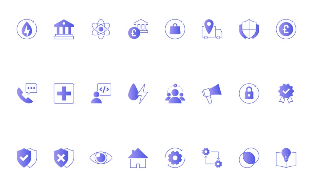
Icons are the unsung heroes of marketing communications, offering concise representation of complex and technical terms. Our branded set of icons has been meticulously designed with accessibility, clarity, and simplicity in mind. This is to ensure that they are effective in communicating the key messages to our customers, and in conveying our unique brand identity.


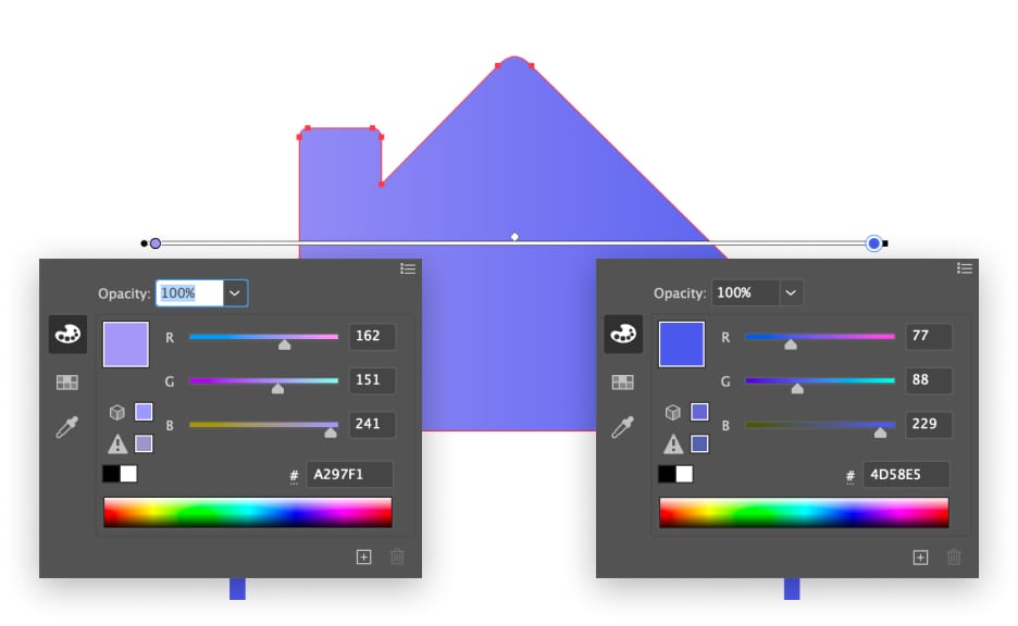
Anatomy
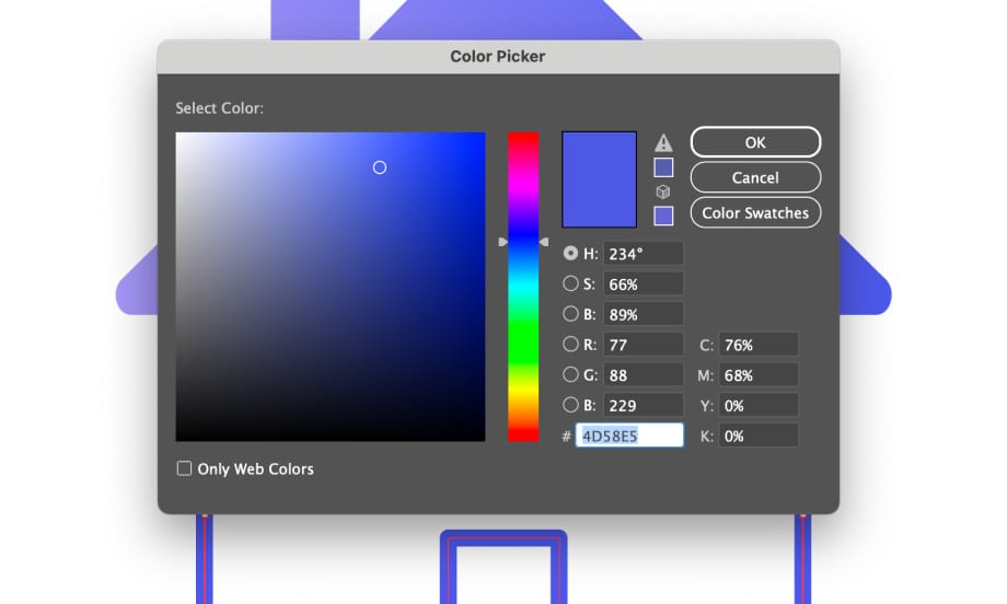
Each marketing icon consists of 3 key elements: a filled with gradient (from #A297F1 to #4D58E5) dominant shape (01), outlined in blue (#4D58E5, 3pt thick) complimentary shape (02) and a blank canvas area (03).


Grid
All marketing icons are designed on a 200x200px canvas / 1px grid (image on the left), and are locked within foundational shapes (image on the right). This helps to ensure that all icons look consistent and clear.
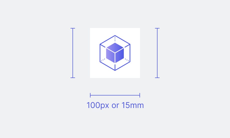
Size
To ensure optimal performance and readability when resizing marketing icons, don’t go smaller than the minimum 100 px or 15 mm, including the canvas area.
Colour application
For new icons, use a linear gradient for filled shapes (#A297F1 to #4D58E5).
And the solid blue colour (#4D58E5) for all outlined elements.
Display our marketing icons on white…

… or black backgrounds only.

Product icons
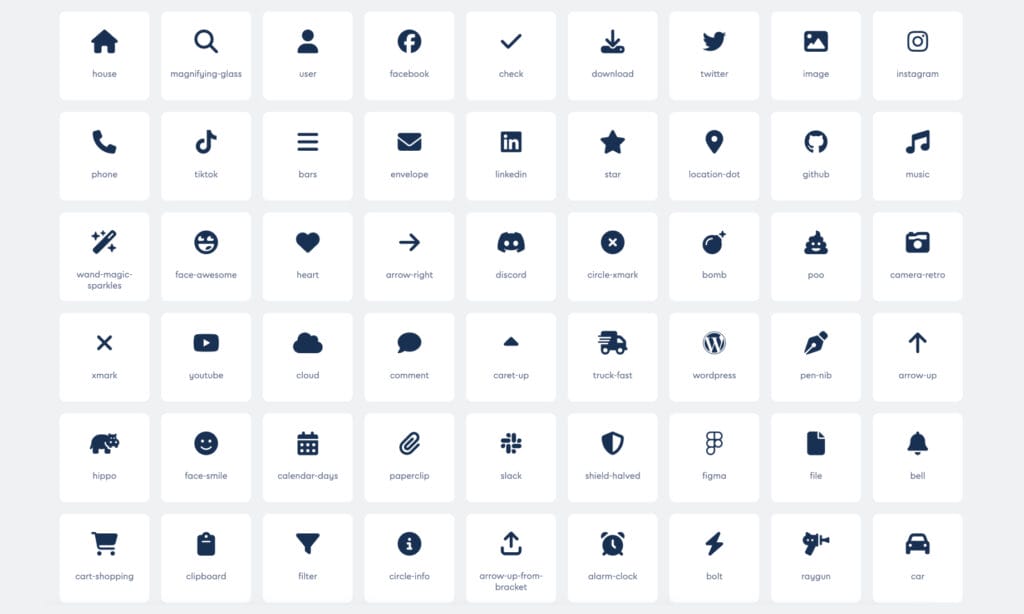
While our branded icons are valuable assets in marketing communications, their detailed nature makes them challenging to scale, rendering them unfit for product use.
When designing UIs of digital products, we recommend using the Font Awesome library instead. It is a widely-used library of scalable vector icons that offers a diverse range of symbols and glyphs for web and app developers to enhance user interfaces. This ensures an ease of use and consistency across all digital products.
Do’s
Favour our branded icons in all marketing communications assets:

Marketing icons should always support relevant, key messages:

When designing new icons, they must stay within the grid:
Create new icons from existing micro components where possible:

Always present icons in the right size, to ensure their prominence and readability:

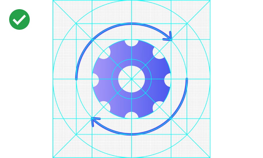
If necessary, rotate icons 45° clockwise:

Don’ts
Don’t use all outlined or filled shapes to
create new icons:

Don’t create icons in 3D:

Don’t display icons on other colours than white and black:

Don’t recolour marketing icons to other colours than allowed:

Don’t change the stroke thickness to other than 3pt:

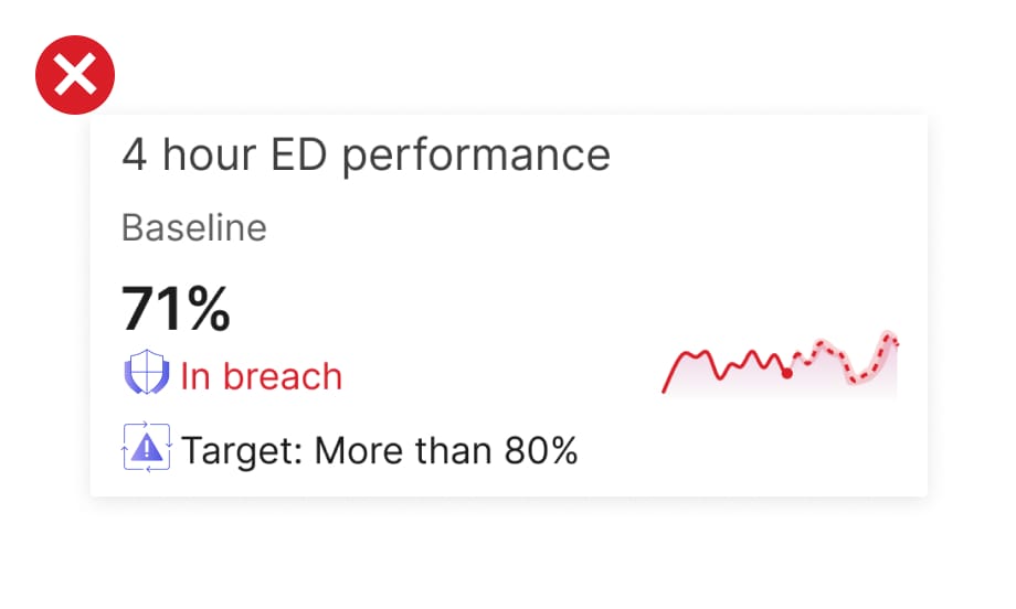
Don’t use marketing icons in product and vice versa: