Typeface tenets: discover our fonts
Primary typeface
Our primary typefaces play a significant role in expressing our identity – showcasing our expertise while remaining accessible to everyone. These meticulously curated fonts blend geometric shapes with subtle accents, symbolising the harmonious relationship between technology and humanity.
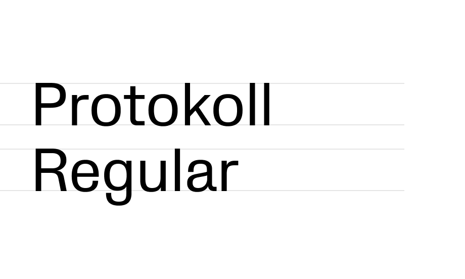
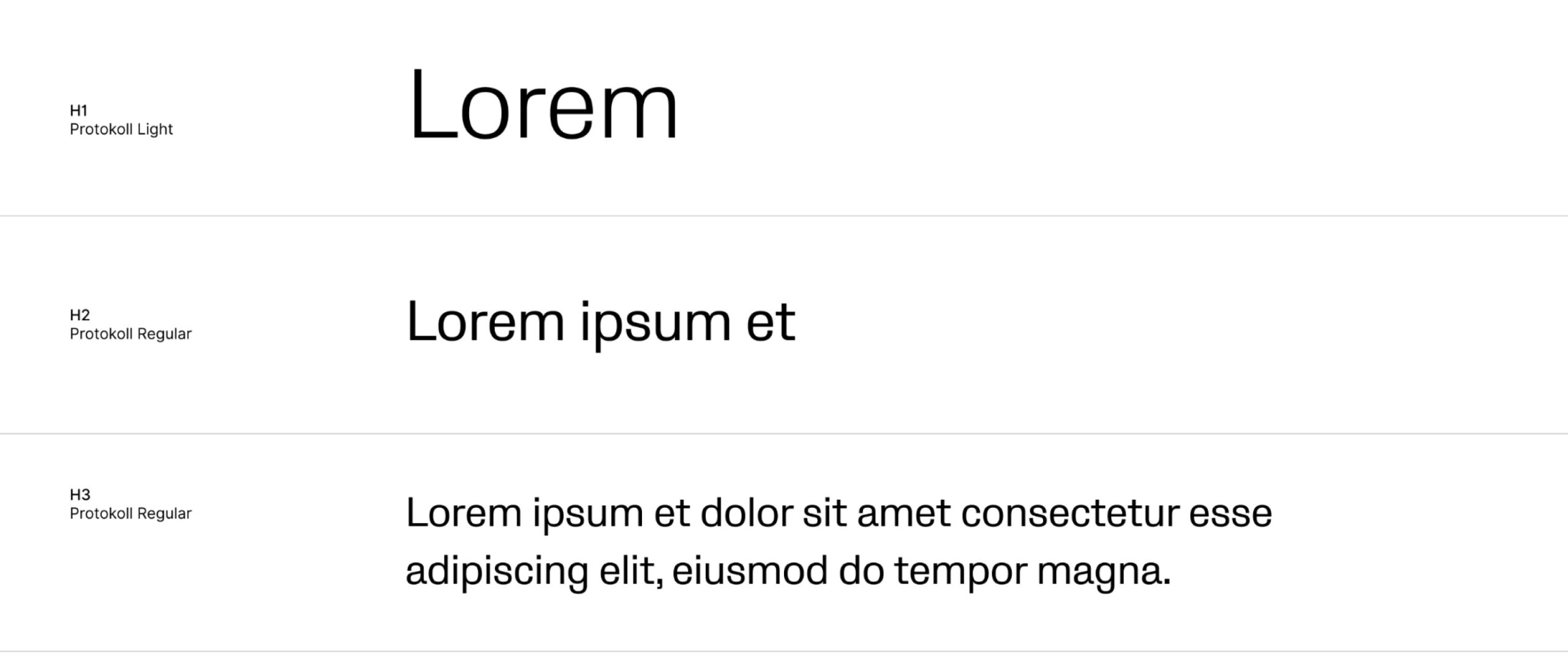
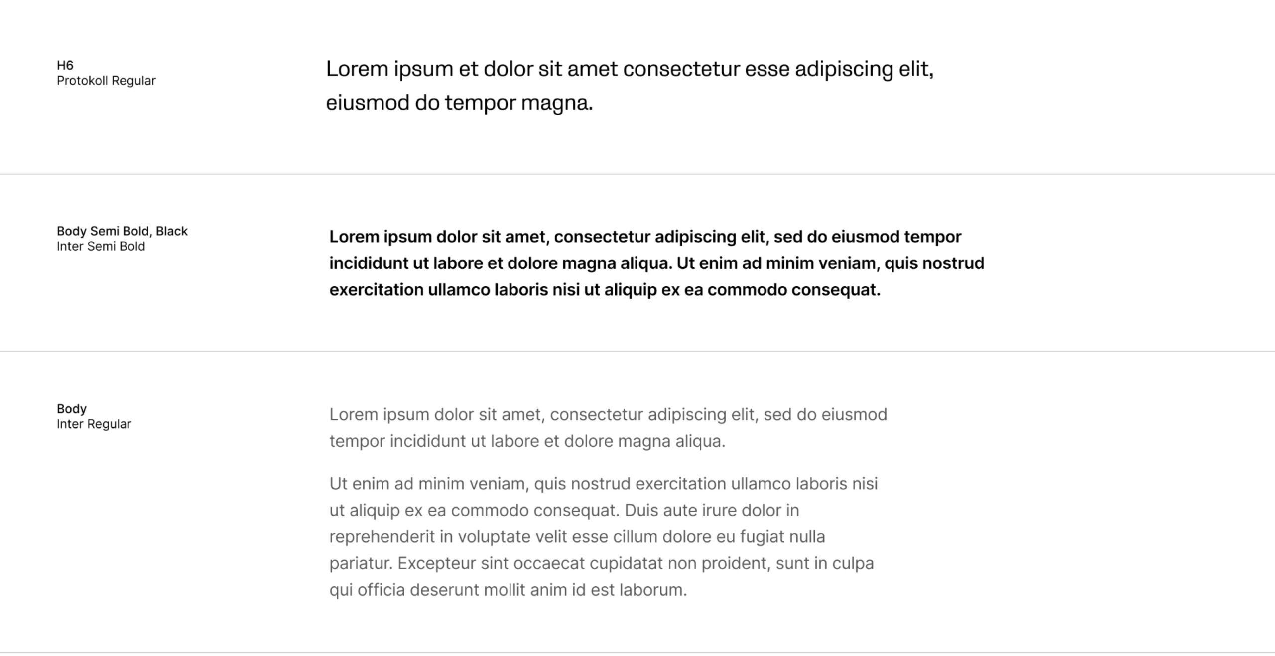
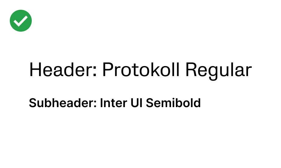
Protokoll Regular for large headers – to give more prominence and clarity to your message:
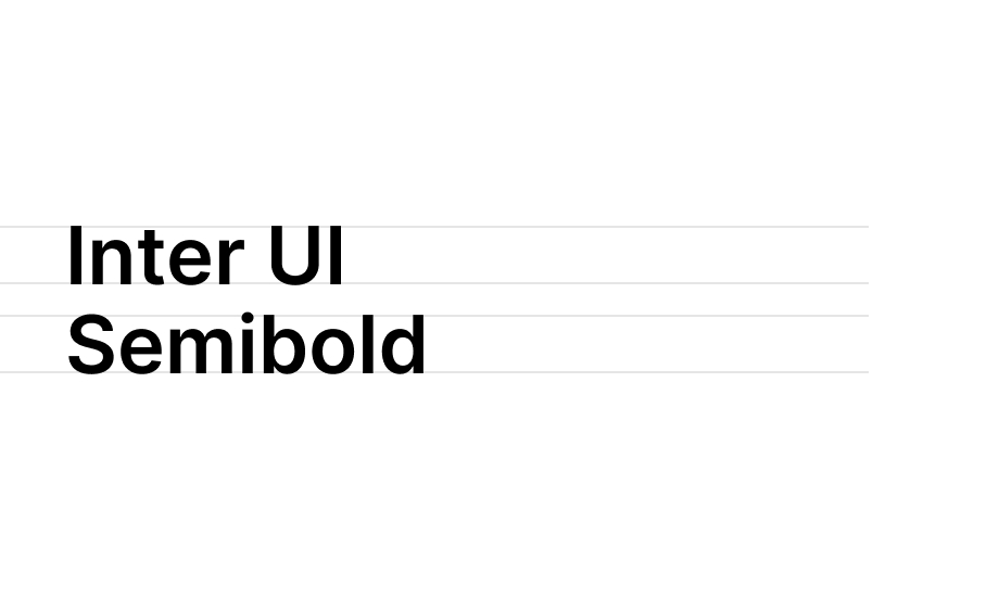
Inter UI Semibold for smaller sub-headers – to balance out large headers:
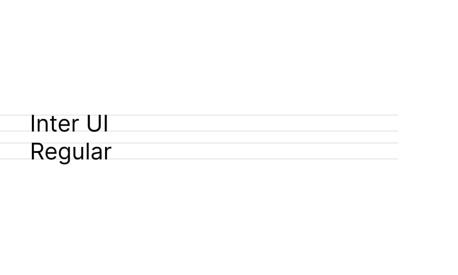
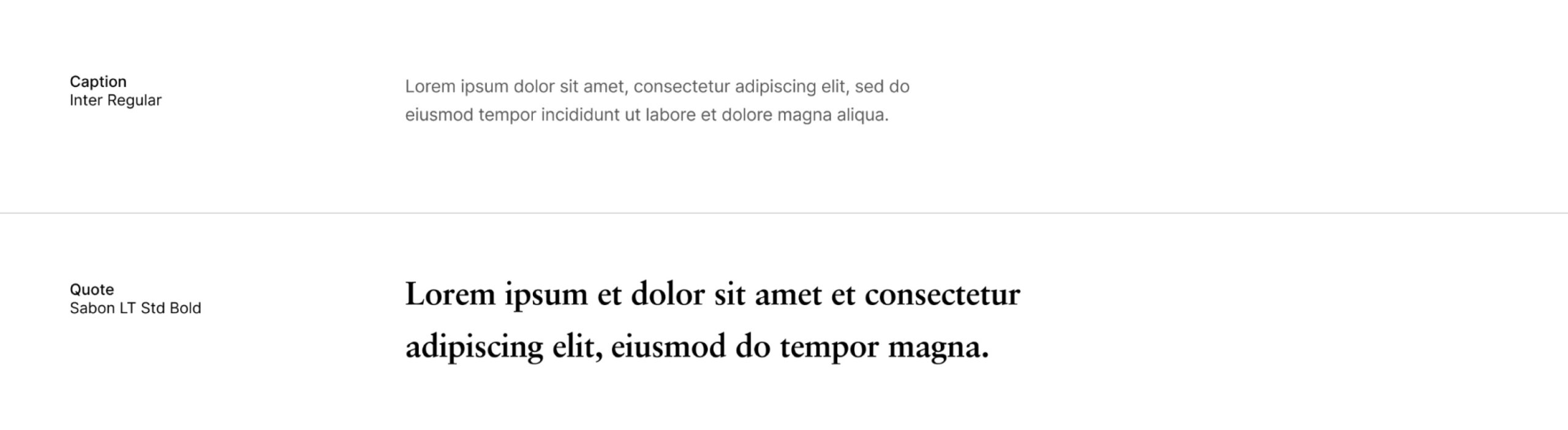
Inter UI Regular for body copy – to ensure readability:
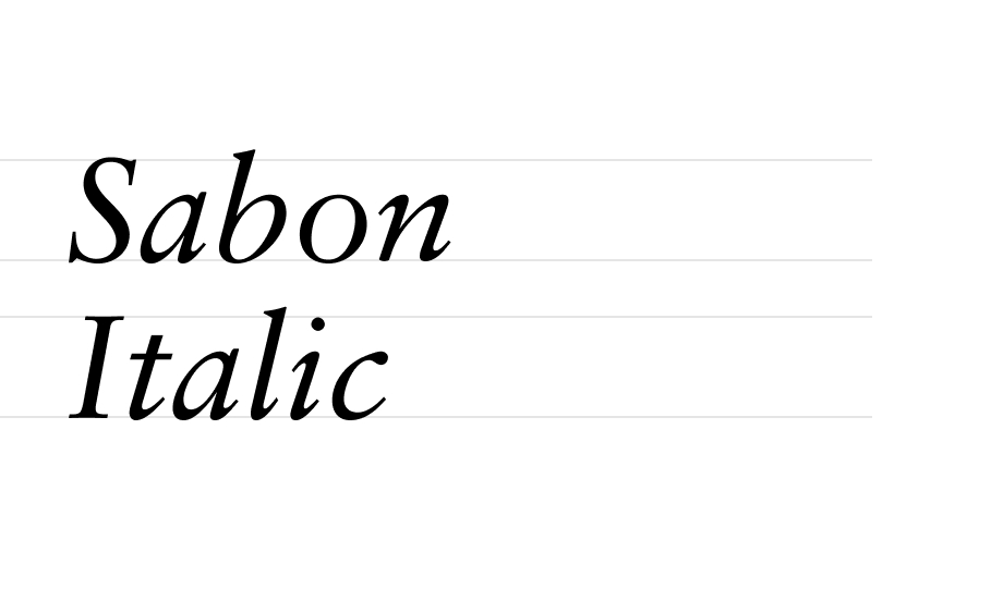
Sabon Italic for decorative call-outs and headlines – to add a human touch:
Hierarchy
Ever noticed how a font can instantly make you recognise a brand? That’s why we keep the hierarchy of our fonts standardised and consistent – making sure each message feels familiar and trustworthy.
System typeface
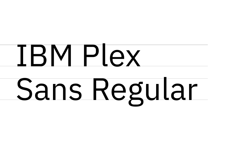
Protokoll, Inter UI and Sabon should be used wherever possible. However, when this isn’t possible (such as when creating documents where primary fonts aren’t installed), we recommend using alternative system fonts which have been selected to closely match with our primary typefaces.
IBM Plex Sans Regular for large headers:
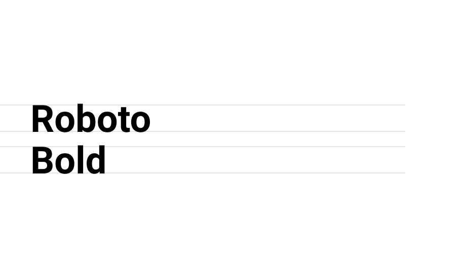
Roboto Bold for subheaders:
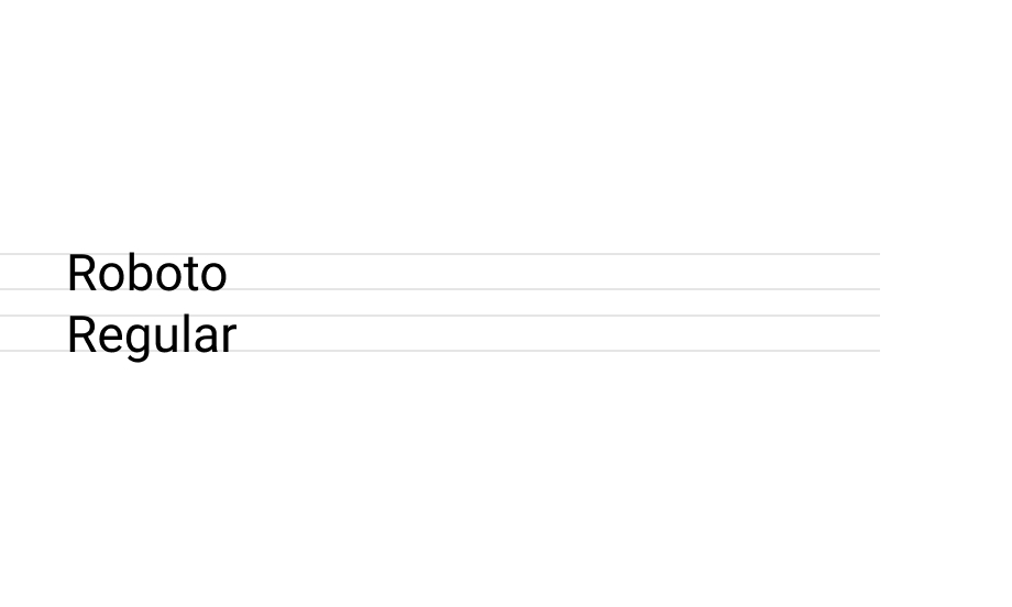
Roboto Regular for body copy:
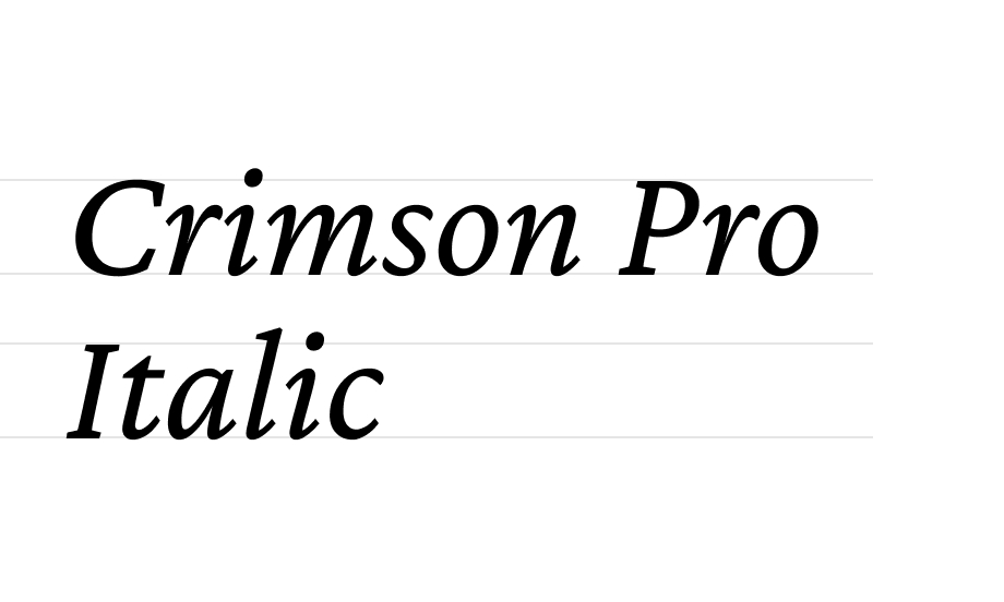
Crimson Pro Italic for decorative call-outs:
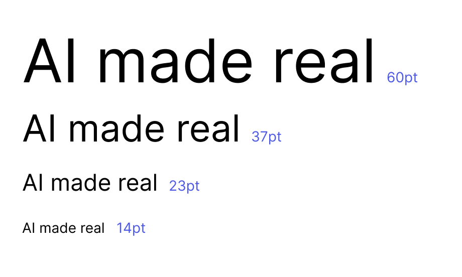
Size ratio
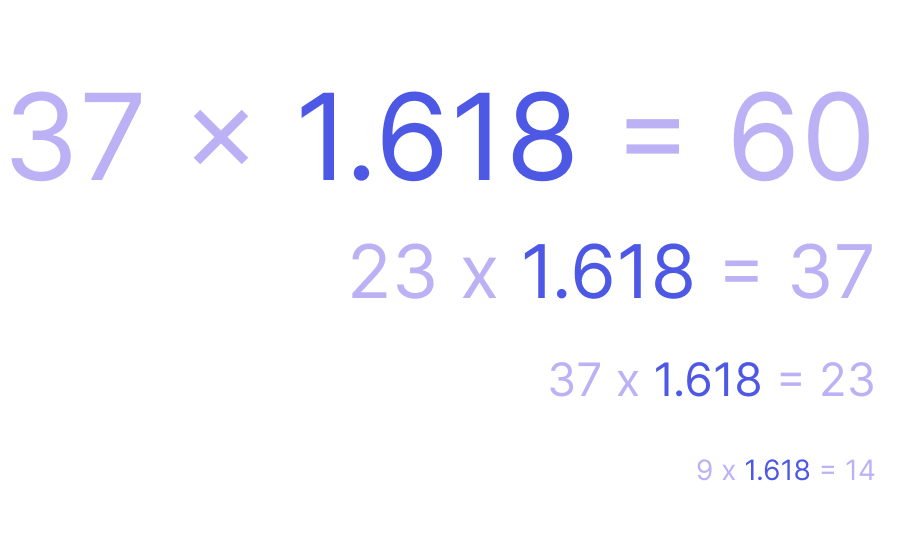
When resizing text across headers and body, we draw inspiration from nature and art to maintain the sense of balance.
The 1.618 golden ratio formula ensures we preserve the right proportions. All you have to do is to multiply / divide your fontsize by 1.618 to get the rough, new size. Eg if your header is 23 pt and you need a fontsize for body copy, simply divide 16 by 1.618 to get 14 pt body copy font size.
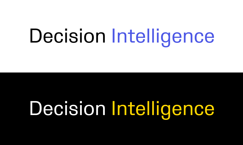
Highlights in headers
In some occasions you will have to highlight specific keywords in headers. Use blue on a white background or yellow on a background.

Body copy, highlights
To ensure the body copy looks readable but not jarring, use #595959 when it’s displayed on white background or #ABABAB when it’s displayed on black background. To highlight specific words or phrases, just bold them and recolour to either #000000 or #FFFFFF.
Do’s
Use colour in headers sparingly and reserve it for supporting imagery instead:
Ensure there is a noticeable contrast in font sizes between headers and body copy:

Use assigned typefaces for headers and body copy:
Use Sabon / Crimson Bold for quotes:

Use blue for hyperlinks on a white
background:
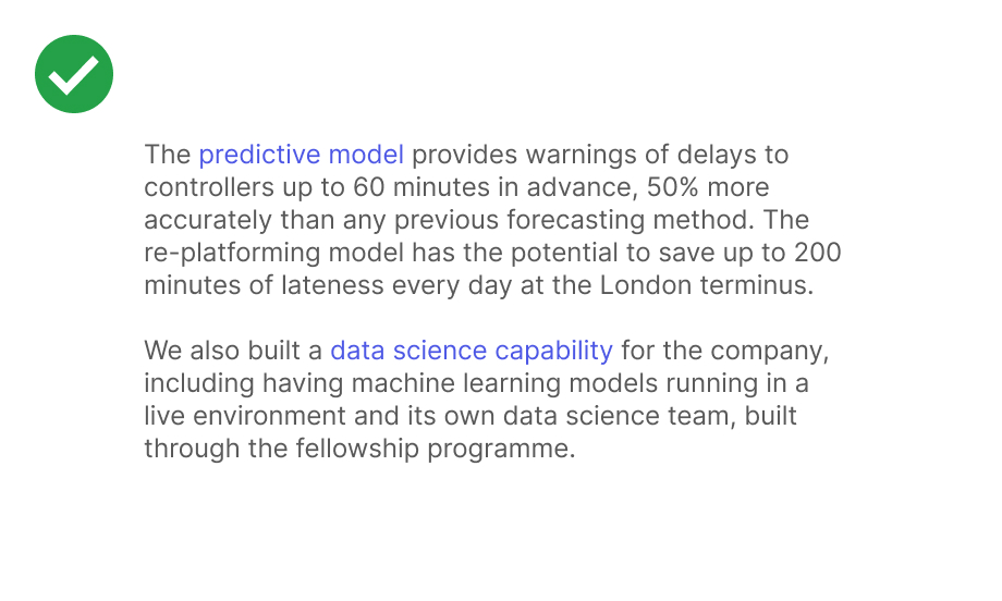
Use yellow for hyperlinks on coloured backgrounds
Dont’s
Don’t overuse Sabon / Crimson:

Don’t use other fonts than Faculty brand or system typefaces:

Don’t hyphenate words over two lines:

Don’t stretch the letter forms:

Don’t use drop-shadows in text:

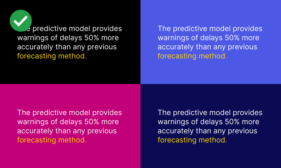
Don’t display magenta text on blue background and vice versa:

Don’t use grey text on colour:

Don’t forget about preserving a high contrast ratio between text and background:

Don’t use random font sizes:

Don’t use all capital letters:

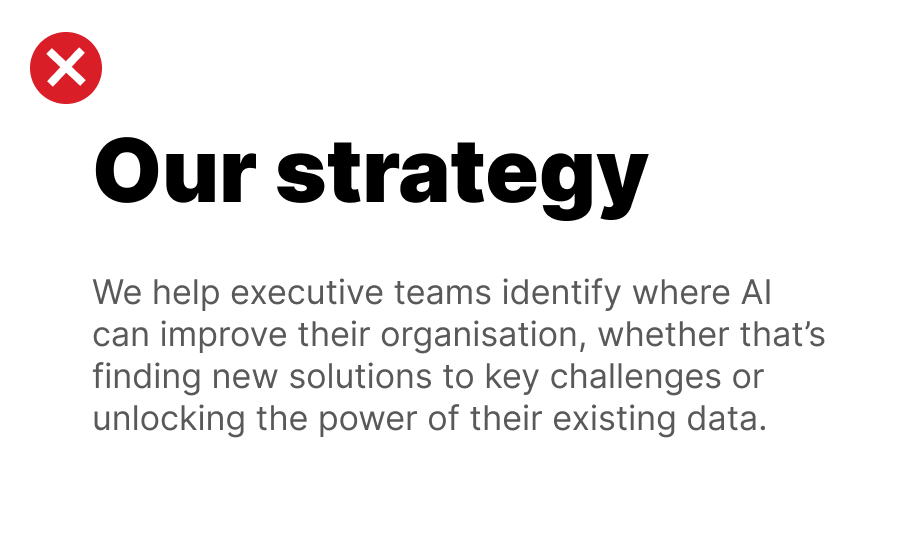
Don’t use bold headers:
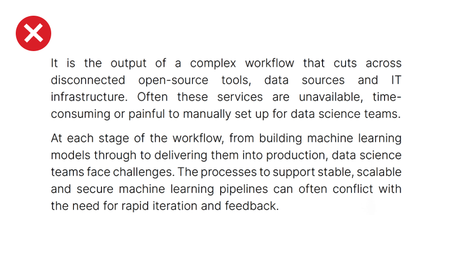
Don’t justify text:
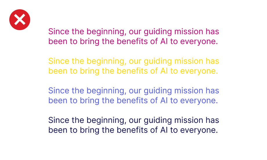
Don’t display body paragraphs in magenta, yellow, blue or midnight blue:
Don’t use multiple colours to highlight keywords: