Picture perfect: our imagery guide
Background imagery
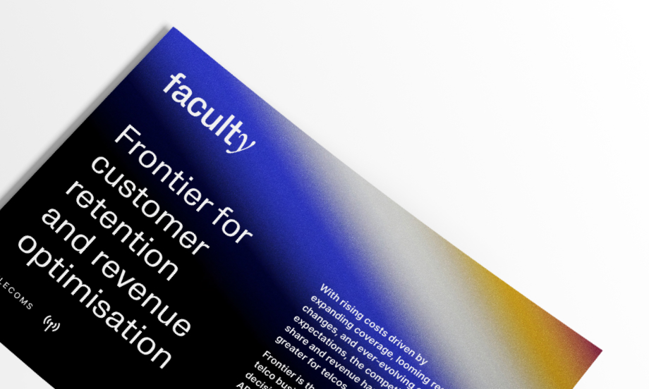
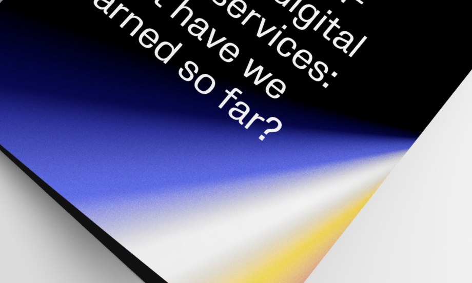
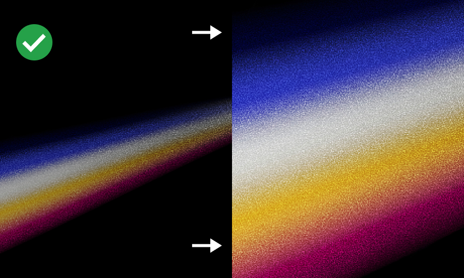
We use Faculty branded background imagery to ensure that our marketing and sales assets are instantly recognisable and strongly associated with our company. By capturing close-ups of refracted light, we convey our brand’s personality traits, subtly complimenting the content which sits in the foreground.
The visual allure of our background imagery resembles pieces of art. This quality draws attention and fosters emotional connections. Moreover, it serves as a unifying pattern across various applications, including marketing, sales collateral, and product materials.

The grain effect applied to our background imagery infuses our brand with a distinctive and timeless character, evoking a sense of nostalgia. This texture adds a human touch, enhancing our narratives and connecting with our audiences on deeper levels.


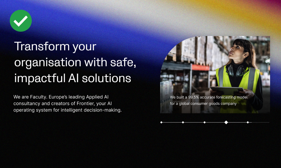
Background imagery subtly warms up our brand and gives it a unique character, but it should be used it sparingly. Reserve it for assets where we introduce Faculty, such as covers, introductory slides, online banners, dividers, impact statements, event stands, and pull-up banners.


Photography style
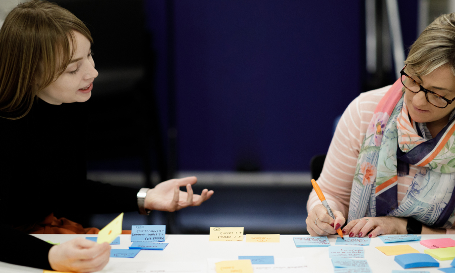
We care about making AI real for everyone; therefore, our imagery style has to feel genuine, authentic and it should convey a meaning. To achieve this, we use reportage style photography that tells a story.
Always use photos of people at their best, in relevant, real life situations: collaborating, solving problems, enjoying their jobs. Photos that capture a moment, convey the atmosphere of the event, taken from interesting, dynamic angles.


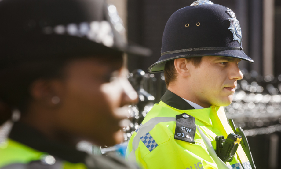
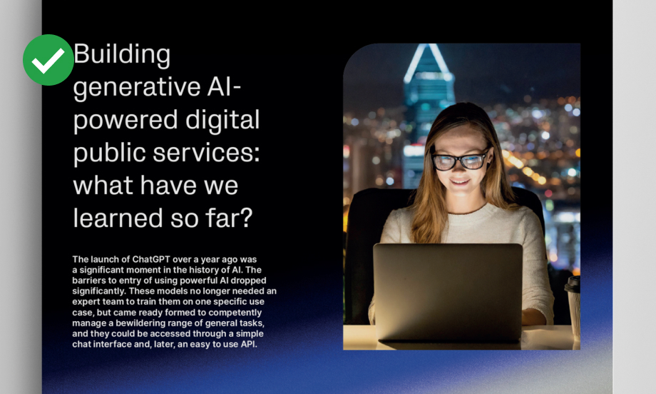
Our photography should always showcase a well-balanced composition, with our heroes (people) sitting as the focal point with little to no noise around them. We favour close-ups to let people’s personality shine through. Photos should have neutral background to ensure there is additional room for our branding and messaging.


Do’s
Use imagery to make your asset look more personal and engaging:

Make sure your photos capture a narrative ‘moment’:

Choose photos with a focal point and a neutral background:

Reduce lightness of background photos to increase the contrast:

Favour photos taken from interesting angles:

Crop images to reveal compelling detail:

Use branded background imagery as an aesthetic addition, behind your content:
Use cropped close-ups of background imagery:
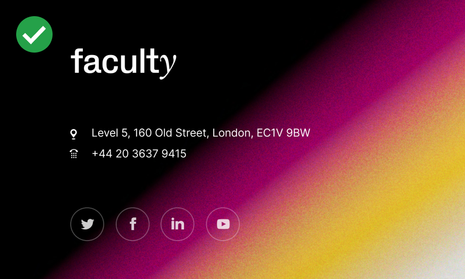
Use ‘full spectrum’ background imagery for headers only:
Favour ‘magenta to yellow’ background imagery for footers in digital assets:
Always use branded imagery with applied grain effect:
Adjust horizon lines of your photos, where necessary, by slightly rotating an image:

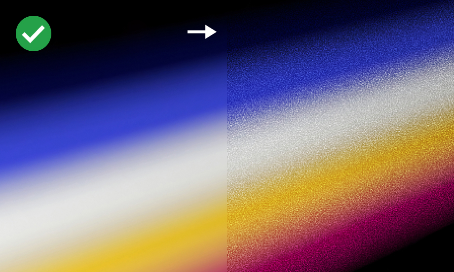
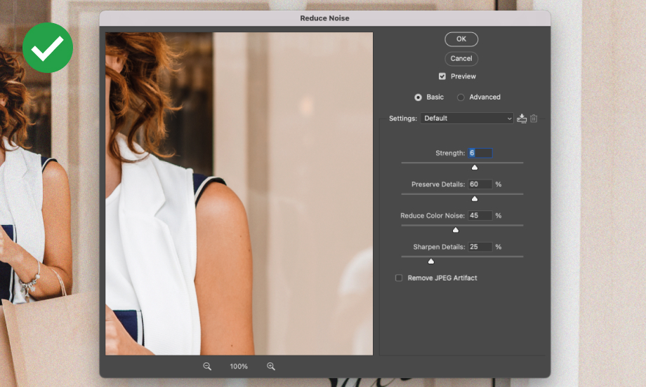
Adjust the noise of your image in Photoshop, if necessary:
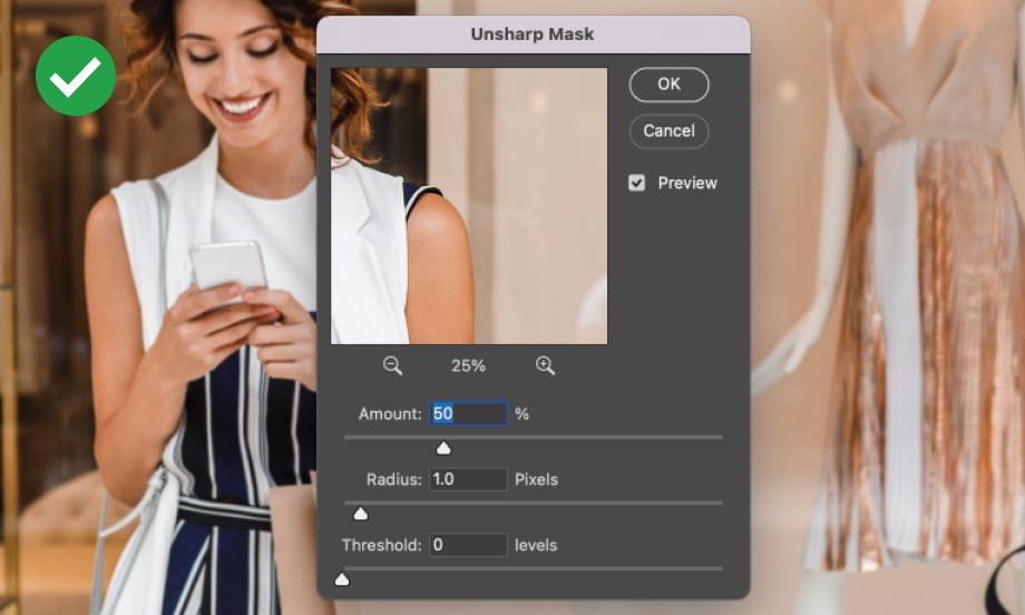
Sharpen an image, if necessary:
Don’ts
Don’t use black and white photos:
Don’t use staged ‘stock’ imagery:

Don’t use photos that look too busy:

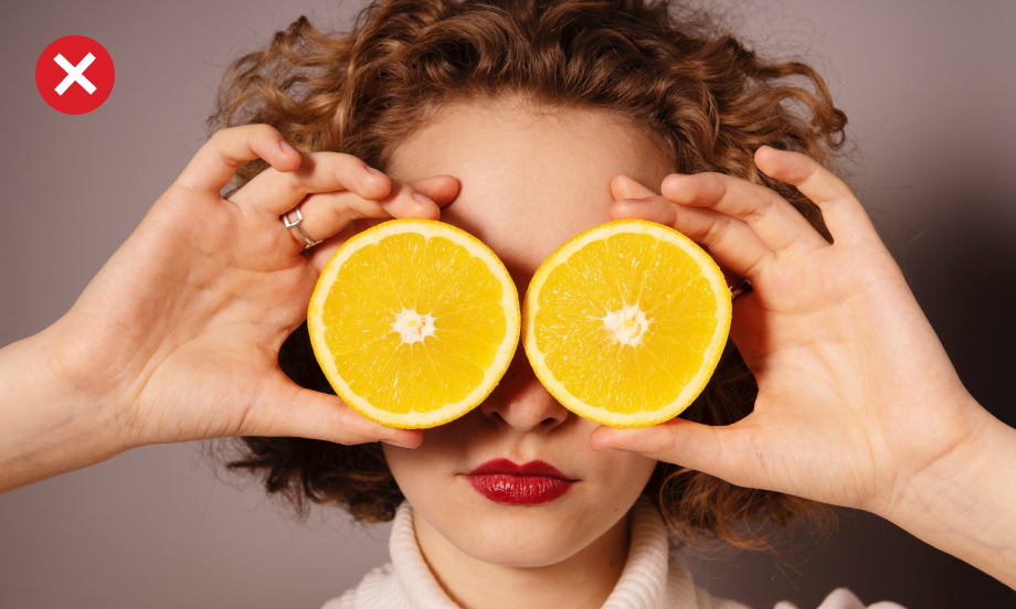
Don’t use photos with props:
Don’t use photos that look too techy / inhuman:

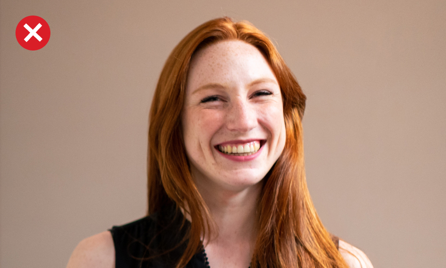
Don’t use photos in visibly low resolution:

Don’t use photos that look too techy / inhuman:

Don’t use photos in visibly low resolution:

Don’t use washed-out photos:

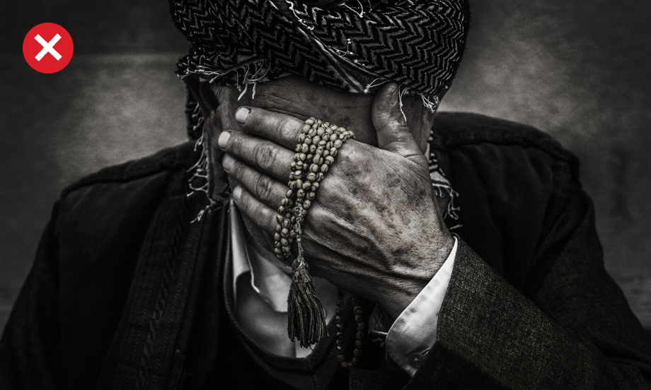
Don’t use sensitive photos:
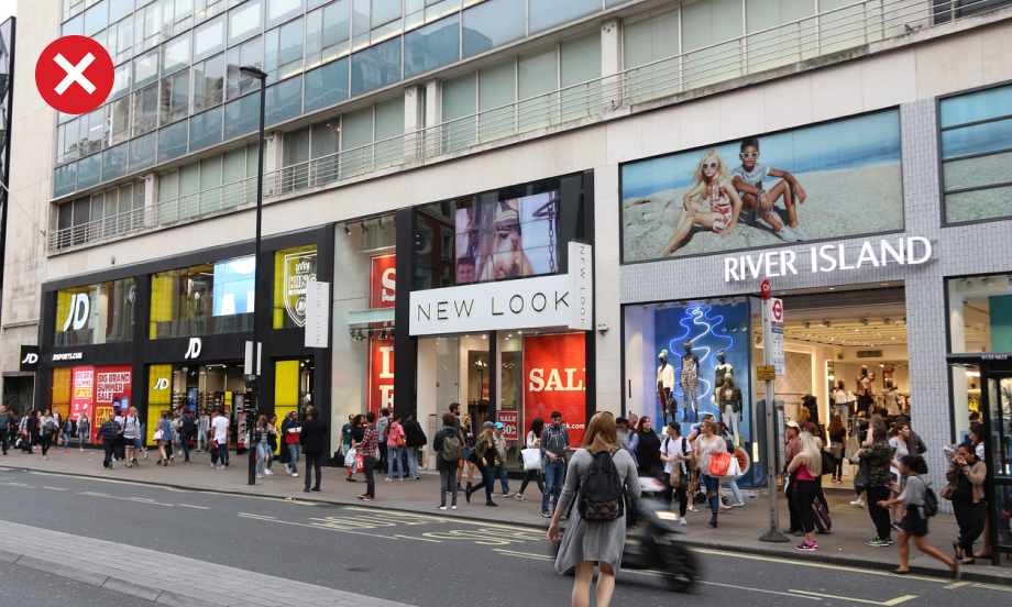
Don’t use photos that feature visible brands:
Don’t use sensitive photos:
Don’t use photos with glare:

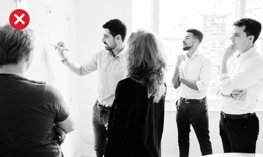
Don’t use photos of people looking very formal:

Don’t show people wearing excessive patterns or ornaments:

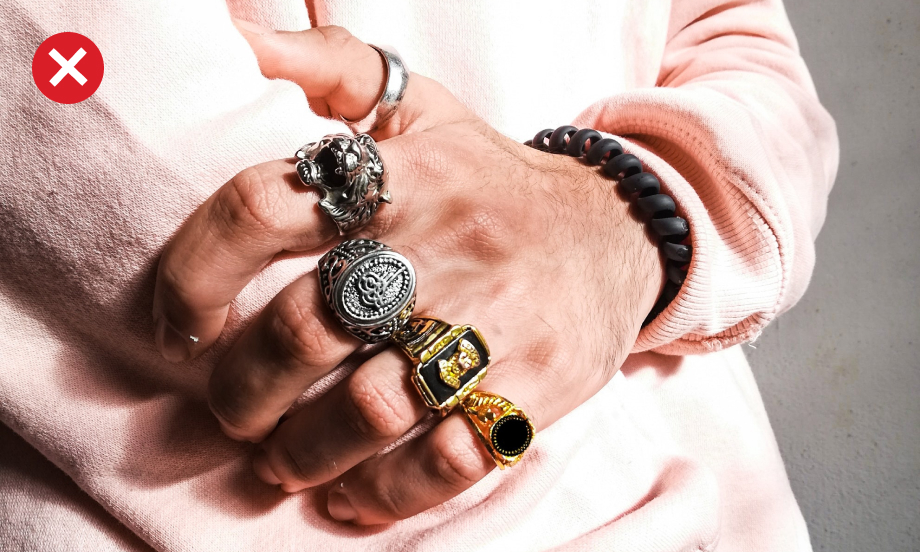
Don’t use photos of people wearing bold jewellery:
Don’t use diagonal lines

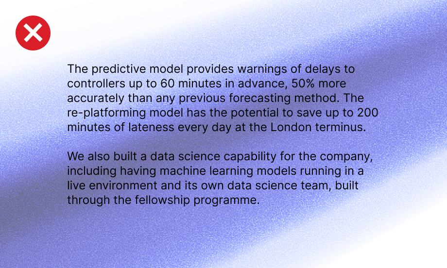
Don’t place background imagery behind small font size text:
Don’t use effect filters:

Don’t add vignettes or frames: