Colour code: understand our palette
Origin
Our brand revolves around wisdom and intelligence at the speed of light. Much like our technology, Faculty’s brand connects siloed people, data, and AI to foster innovation and make a positive impact. We chose light to be the focal element due to its unparalleled speed – nothing can surpass its ability to transfer data. Light feels premium, like our solutions, but also optimistic, which reflects our personality.


Our brand colours are inspired by the phenomenon of light refraction. When white light passes through a medium like a prism, it refracts, with each colour bending at a slightly different angle due to variations in wavelength. This dispersion creates a spectrum, showcasing the captivating interplay of science and art, resulting in white, black, blue, midnight blue, magenta, and yellow colours.

Primary palette
Our primary color palette is subdued, with white serving as the foundation complemented by black and various shades of grey. This monochromatic scheme not only reflects the binary nature of computer code but also embodies our timeless and contemporary business culture. As trusted experts in our field, we are committed to empowering our customers.
White
#FFFFFF
R:255 G:255 B:255
C:0 M:0 Y:0 K:0
Light grey
#ABABAB
R:153 G:153 B:153
C:0 M:0 Y:0 K:40
Dark grey
#595959
R:89 G:89 B:89
C:0 M:0 Y:0 K:65
Black
#000000
R:0 G:0 B:0
C:75 M:75 Y:75 K:100
White and black (symbols of sophistication and purity) are enhanced by the hues of blue (trust, professionalism) that transition to magenta (passion, transformation) creating an illusion of purple that stands for intelligence and wisdom. Yellow is our accent colour (optimism), discreetly warming up our brand and directing the eye where necessary.
Blue
#4D58E5
R:77 G:88 B:229
C:90 M:77 Y:0 K:0
Midnight blue
#0B0B52
R:11 G:11 B:82
C:100 M:87 Y:0 K:68
Magenta
#C10078
R:193 G:0 B:120
C:23 M:100 Y:12 K:7
Yellow
#FFD700
R:255 G:215 B:0
C:1 M:13 Y:92 K:0
Secondary palette
Use secondary colour palette (tints, shades and tones) when the primary palette is inadequate for conveying the message, e.g. in illustrations, diagrams and data visualisations.
Secondary tints:
#000000
#4D58E5
#0B0B52
#C10078
#1B1B1B
#6767E8
#2B2062
#CA3685
#303030
#7D77EB
#433573
#D25292
#474747
#9087EE
#5A4B84
#DA6A9F
#5E5E5E
#A297F1
#716395
#E181AC
#777777
#B3A8F4
#887BA6
#E796B9
#919191
#C3B9F6
#9F94B7
#EDABC7
#ABABAB
#D2CAF9
#B7AEC9
#F3C0D5
#C6C6C6
#E2DBFB
#CEC8DB
#F7D5E3
#E2E2E2
#F0EDFD
#E7E3ED
#FCEAF1
Secondary shades and tones:
#474FCC
#AC0C6B
#4650D5
#B00374
#4146B3
#98135F
#3F47C6
#A00670
#3B3E9A
#841653
#393FB6
#8F086D
#353683
#701747
#3238A7
#7F0A69
#2E2E6C
#5E173C
#2B3098
#6E0B65
#272656
#4B1631
#25288A
#5E0C61
#201E41
#3A1426
#1F217B
#4D0C5D
#19172D
#29111C
#18196D
#3B0C5A
#110D1A
#190A11
#12125F
#280C56
Colour ratio
With such a diverse array of colours available, it can be tempting to use them all simultaneously. To prevent overuse, we’ve created a colour ratio to guide you through the creative process and help ensure you maintain the right balance.

In general, we favour white backgrounds to ensure the content stands out, offering a blank canvas that allows for breathing room. Black backgrounds can be reserved for introduction slides, banners, or impact statements, serving as a frame for your canvas. On certain occasions (e.g. data vis, diagrams) midnight blue can replace black background to make your asset stand out.
Our hero colours are blue and magenta, but they should be used sparingly, only to bring more life to your asset. Use hints of yellow to draw the eye, while always aiming for harmony, with your content at the centre and little noise around it.


Colour in application
When used correctly, colours can be our greatest assets. Consider it as a multifaceted tool that you can use to achieve certain goals – for example, to draw the eye of your reader to a specific element.
For instance, when you want a specific element to stand out.
Draw attention to a call-to-action, button, or hyperlink.

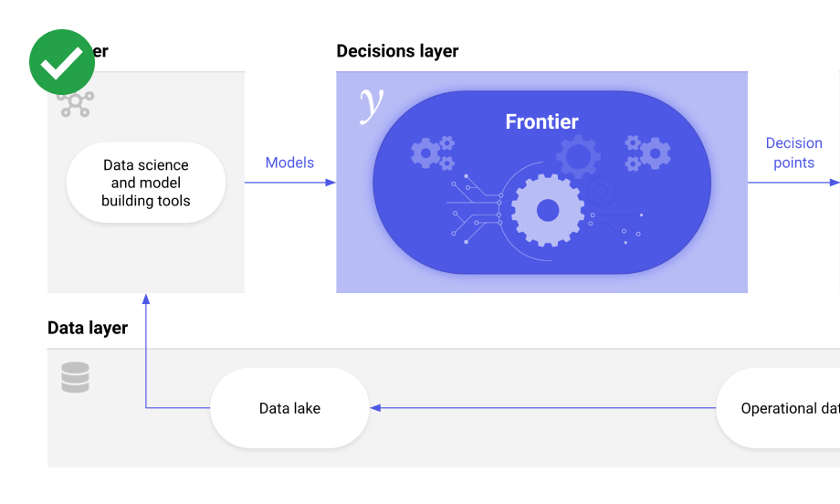
Illustrate concepts, ideas, diagrams.
Group similar elements to direct the eye.

Colour encode metrics when visualising information.
Give a distinct personality by using our branded background imagery.

Applied AI
Services
Do’s
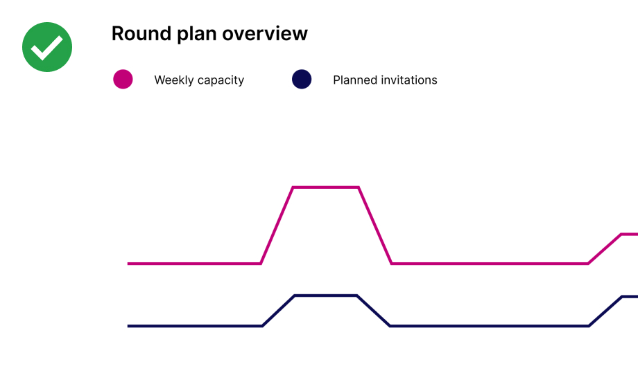
Use colours sparingly and with intent, e.g. in illustrations:
Use maximum 2 colours + background colour in a single view:

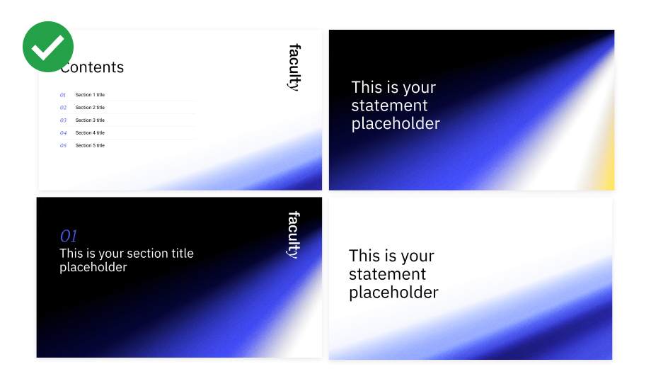
Favour black backgrounds for introduction slides:

Favour white backgrounds for main body copy, graphics, illustrations and data visualisations:
Use yellow colour sparingly, only to draw attention to important elements:
Use colour to communicate specific relations (eg colour encoding):
Maintain consistency in colour usage across your assets:
Incorporate colour tints, shades and tones thoughtfully to add depth and dimension:

Use white space strategically to balance vibrant colour elements:

Maintain visual hierarchy by using one dominant colour in a single view:
Dont’s
Don’t use other colours than branded palette, (unless it’s customers’ or partners’ branding):

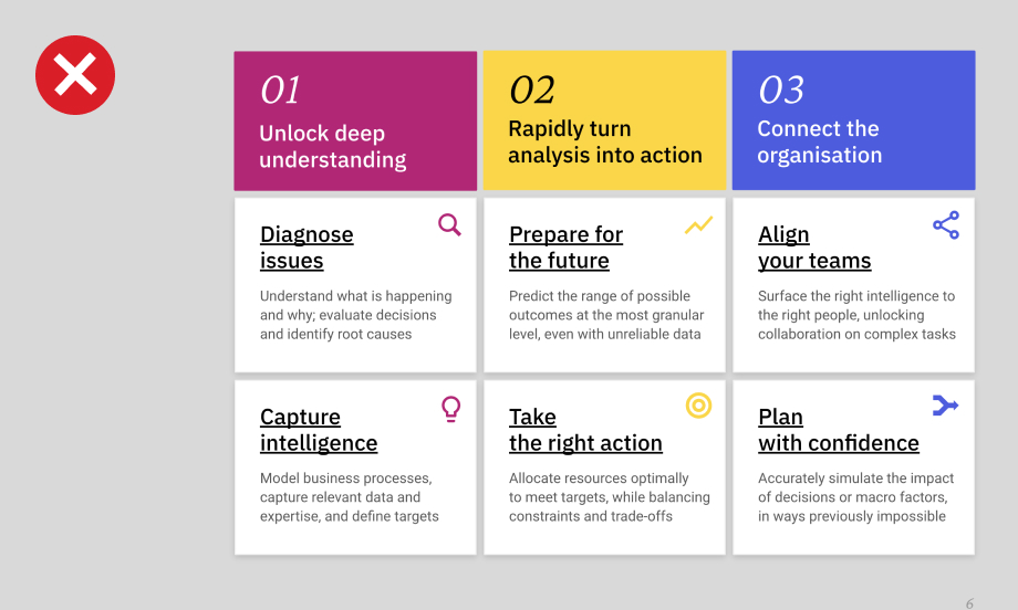
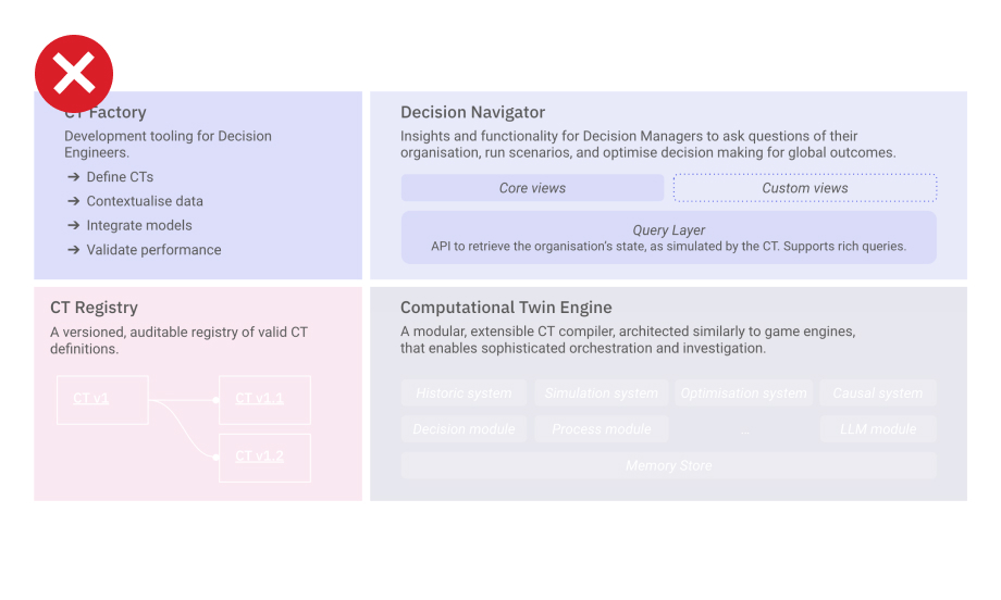
Don’t overkill your assets with too many colours:

Don’t use colours randomly, without purpose:
Don’t use too much of one colour:

Don’t use grey backgrounds:
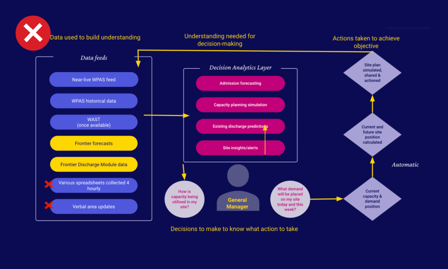
Don’t pair blue with magenta:

Don’t use too many faded colours without a sense of hierarchy:
Don’t overuse the yellow colour: